Indigo, Shibori & Block Printing

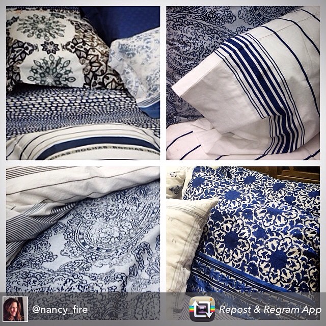
This season “Feeling the Blues” in print and pattern is super creative because it’s all about different artistic techniques like Shibori and Block Printing. Patterns are imperfect because each print takes on its own personality and style due to the technique being used.
Colors range from deep dark indigo to powder blue with accents of teal creating unexpected highlights.

It’s encouraging to see these patterns at retail that look updated and fresh. When styling prints like these it’s best to introduce enough white to help the pattern from becoming over saturated. It’s refreshing to see the clean blue and white stripe in the mix which acts as a more traditional addition to the variation of techniques this season.

At Design Works International, my design studio in NYC, our print collections are looking like a creative mix of Shibori, block printing, tie-dye and watercolor. As designers we are so excited for this very innovative print and pattern season!

We are always looking for freelance and full time designers to join our talented team, if interested please e-mail us at careers@designworksintl.com

IMG_5162

Finding the Beauty in a NYC Winter!

It’s that time of year in NYC when even the strongest of “New Yorkers” are trying to keep their NYC spirit alive!

Waiting on freezing subway platforms for the train that never seems to arrive or fighting the slushy sidewalks of commuters or those client cancellations due to mass transit delays.

Take some advice from a “Native New Yorker”…enjoy the rustic glam that NYC has to offer…the lighting this time of year reflecting on buildings is incredible, Central Park is truly a winter wonderland and a photographers paradise both in the day as well as the early evening!

The skies might be grey, the buildings might look a bit dodgy from the winter weather and the streets might be full of debris from past storms but it’s all part of the NYC winter experience!

Try looking at our “Rustic Glam” sensibility like a ” Native New Yorker” and enjoy the beauty of a New York City winter!

Photography-Nancy Fire

IMG_4719-1

IMG_4680-1

IMG_4380-1

IMG_4684-1

Valentines Dream Home

Well it’s that “day” of the year again #love, when we all overload on everything red, beautiful flowers and various types of chocolate surprises…but for those more interested in “one of a kind homes” check out my house spotting find in Wales last October…Sending a different kind of #love this year! Lots of color and creativity but no chaos!

IMG_4563

Home Sweet Home…NYC

Always great to come home after many weeks of traveling for business…cannot complain when my travel was to Germany…Paris…Las Vegas…and sunny Tampa…but returning to NYC is an adventure in itself!
Wanted to share this beautiful NYC greeting….it’s nice to be back in NYC and to take the time to appreciate the natural beauty that we some times take for granted!

IMG_4047-0

“Rustic Glam”

Trending at retail, in restaurants and in many homes these days is a sensibility I call “Rustic Glam” It’s a mix between “glam and raw materials”. Best to think of this style as “the new industrial” something I have been talking about for the past two years!

Coming off of a two week trend and research trip both overseas as well as in the states…I really am enjoying this universal sensibility and style.

The first photo is a great example of using metallic accents as the “glam” against wallpaper that has a more rustic style…shown here from the KBIS Show last week in Las Vegas!

The next photo was taken in Germany at the Heimtextil Show which received 615 likes on my HGTVHOME Instagram!

The brick, mirror and light fixture are from a very groovy resturant that I visited while art directing our HGTV photo shoot for HSN IN Tampa…called “Oxford Exchange” located downtown at 420 West Kennedy Boulevard!

Yes, it’s in the mix and this season it’s refreshing to see different substrates
like wood, metal, sequins and texture working together in the home.

Enjoy the mix and “make it your own” by combining techniques and textures that are inspiring!

Happy Designing!!!

2015/01/img_2934.jpg

2015/01/img_2771.jpg

2015/01/img_3553.jpg

Bold Colors are Back!

Bold…Blocking…and Beautiful!

Saturated color for the home is an upbeat option for those who are willing to give it a try!

Years ago bold color was considered “Chaotic” in the home because it was considered “Avonguard” and “Artsy”…but by today’s standards many of us love self expression and are drawn to what is different, especially because color is so personal and can define your style!!

A great way to introduce color into the home is by a few defining accent pieces that will give any space a bit of color personality!

Check out my current “color finds” from Maison & Objet in Paris and enjoy adding some color into your life!

2015/01/img_3332-0.jpg

Posting from Paris

Off to Maison & Objet, the largest and most aspirational home product show in the world. Designers, as well as creative manufacturers gather to show their latest and greatest products for the home.
Most trade shows feel endless and overwhelming but I can promise there is No Chaos here…just color and creativity.
I will be posting on colorchaosand creativity all weekend with lots of updates from Paris AND you can follow me on Instagram @nancy_fire @hgtv @hgtvhome

2015/01/img_3050.jpg

KBIS SHOW LAS VEGAS

Posting from KBIS in Las Vegas and I fell in love with these amazing tiles from Walker Zanger. The dimension and texture in each of these patterns is incredible!
So nice to see the resurgence in detail at The Kitchen and Bath Show (KBIS) in products like tile, flooring and in overall design aesthetic.

2015/01/img_2911.jpg