Tile…Texture…Turquoise


          Photo credit @nancy_fire

Tile: Just love this multi-color herringbone tile floor from The Bon Marche in Paris. Nice alternative to just a black and white floor!

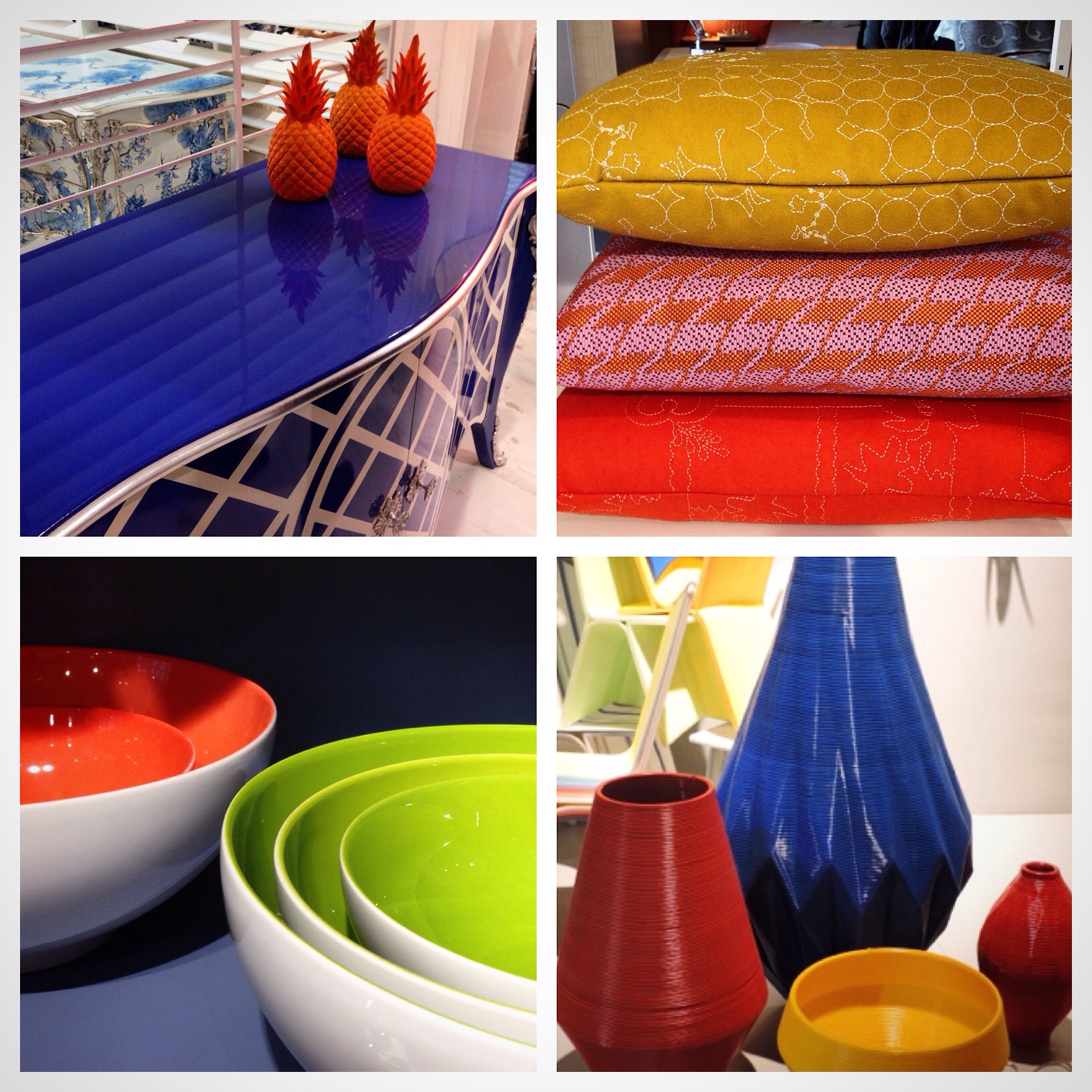
Texture: Perfect update to tones of neutrals when it comes to different wood and wood textures…dyed wood accent colors like this turquoise, indigo and marsala.

Turquoise: With the return of the blues (did they ever leave) Turquoise seems to be the universal tone of the season mixing well with Indigo on the cool side and its compliment Orange on the warm side.

Inside Out

Inspiring to see a shift in trends where color can be used in a non-conventional way…from the inside out. 

For many of us dinnerware and tabletop products have been white on white for years so it’s refreshing to see these serving bowls that I spotted in Paris at The Bon Marche last month…updated with a colorful surprise!


           Photo Credit @nancy_fire

Bridge Perspective…..NYC 

Even from a far NYC intrigues me…no matter where I stand I always seem to fall in love all over again with it’s timeless beauty.

Perhaps it’s the subtle neutral tones of the skyline or it’s eclectic architecture that seems to calm my soul. And yes, the chaos of course…the good kind that promotes creativity and promise!

I ❤️ NY!

.            Photo Credit @nancy_fire

Trending Colors Even in Succulent Plants!

Funny how “what comes around goes around”, even in plants these days. Heading back from Paris last month I was elated to see that the softer side of color was out and about in many product categories…even in the composition of these beautiful succulents!
The beauty to me was the addition of the lava planters used to offset the feminine pastel coloration of the plants. Nice display of the trend “Rustic Glam” that I wrote about a few weeks back in one of my posts!
Beauty comes in many forms and these succulents sure prove that through color and texture.

IMG_3346

Valentines Dream Home

Well it’s that “day” of the year again #love, when we all overload on everything red, beautiful flowers and various types of chocolate surprises…but for those more interested in “one of a kind homes” check out my house spotting find in Wales last October…Sending a different kind of #love this year! Lots of color and creativity but no chaos!

IMG_4563

Home Sweet Home…NYC

Always great to come home after many weeks of traveling for business…cannot complain when my travel was to Germany…Paris…Las Vegas…and sunny Tampa…but returning to NYC is an adventure in itself!
Wanted to share this beautiful NYC greeting….it’s nice to be back in NYC and to take the time to appreciate the natural beauty that we some times take for granted!

IMG_4047-0

Bold Colors are Back!

Bold…Blocking…and Beautiful!

Saturated color for the home is an upbeat option for those who are willing to give it a try!

Years ago bold color was considered “Chaotic” in the home because it was considered “Avonguard” and “Artsy”…but by today’s standards many of us love self expression and are drawn to what is different, especially because color is so personal and can define your style!!

A great way to introduce color into the home is by a few defining accent pieces that will give any space a bit of color personality!

Check out my current “color finds” from Maison & Objet in Paris and enjoy adding some color into your life!

2015/01/img_3332-0.jpg

Color, Chaos & Creativity…Take ONE

Welcome to my first blog post…as Creative Director of Design Works International NYC and Design Director of HGTV HOME I want to share my global travels with you and bring a bit of color, chaos (the good kind) and creativity into your life.
Join me on my journey for updates on anything design…first up Frankfurt Germany…on my way to the Heimtex, the largest Textile Show in the world to premiere our new Home Furnishings Textile Collection for upholstery, wallpaper, rugs and bedding.
Posting trends on color, fabric and products all week with a bit of chaos…the good kind when dealing with creativity!

2015/01/img_21481.jpg