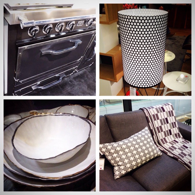
Graphic Greats…Black and White Prints and Patterns in Paris

Bold bedding geometric inspired prints in black and white in BVH department store in the Marais section of Paris.

Gift set mug collections in black, white and gold featuring text graphics in various type fonts.

This teal color [on the blue side] is the second largest influential color behind black at retail in Paris.

Over scaled geometric prints lend a graphic vibe to any sofa, bed or chair.

At the Merci Concept Store in the Marais section of Paris, tabletop was truly a trend to be reckoned with adding mini dishes and plates to the mix.

This bed set at Conran’s on the left bank of Paris was just one of many graphic inspired beds throughout the city.

At Galleries Lafayette Maison, these graphic towels in black and ecru have a tribal vibe that coordinate well with the graphics aesthetic of the season.

At Le Compagnie Francaise, graphic one color ikat patterns compliment this mixed substrate chair of leather and vinyl cording.

This woven bench detail at BVH is not only trend right, it’s a practical solution for expanding seating in your home.

At Merci Concept Store, it’s all about the graphic and global mix, showcasing authentic woven baskets in black and white, mixed with rustic matte and glossy black ceramic vessels.

Surtex NYC Trend Update Part Two

Surtex NYC Trend Updates From Color, Chaos and Creativity….Part Two


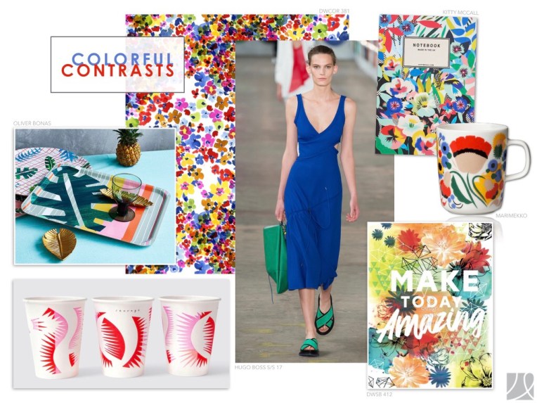
Colorful Contrasts highlight this season by adding fresh and fun color to an assortment of products from paper goods, tabletop, fashion as well as home decor accessories. Do not be afraid of positioning primary colors together especially in full coverage patterns. Royal blue, teal, red and fuschia are leading the pack with a powerful punch of color!


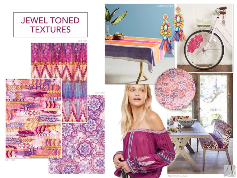
Jewel Toned Textures keep our textured trend alive in 2017-18 with a shift in color to a warmer color palette. Fuschia, tangerine, golden yellow with accents of blue are updated color combinations for the season.


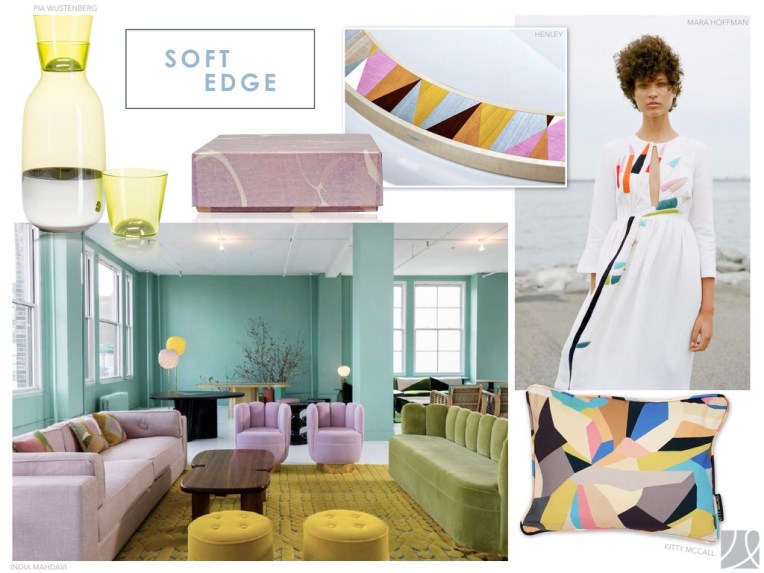
Mostly in home decor we are still seeing soft pastel shades mixed with deep accents trending in fabric prints and patterns. Millennial Pink continues to take the lead with lilac, grey and yellow creating this Soft Edge update!


It’s back, looks like Seaform of the 80’s is back with a vengeance looking new and updated mixed with black and white.


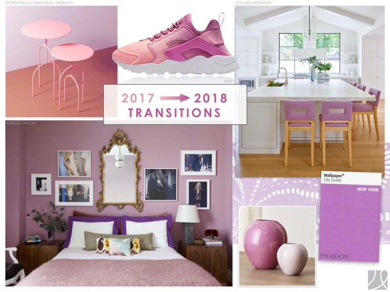
Transitioning from Millennial Pink to Mauve/Lavender will be a trend we will be watching as pinks transition over the next few months.

All Design Works International Prints and Patterns are owned by our studio until time of purchase. To purchase designs log into designworksinternational.com and click on shop prints…you will need to sign into your account or create a new account. Any questions e-mail nfire@designworksintl.com

Surtex NYC Trend Update Part One

Last month at Surtex NYC, I gave a seminar on Color, Chaos and Creativity..trends relating to the fashion, home and accessory markets. Posting my first update today and will continue to post the rest this week on color, chaos and creativity.

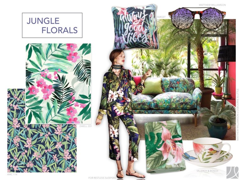
Jungle Florals and Tropical Treasures…redefining our lifestyle by bringing “the outdoors indoors” with oversized jungle inspired leaves and flowers. Greenery with bright pops of pink, violet and turquoise.


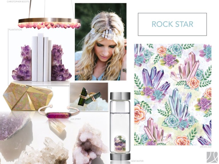
Our Rock Star trend is a millennial “must have” with spiritually topping the charts with crystals as the next craz! Soft pastels are accented with rich purple and magenta shades.


Colorful Catci take succulents to a whole new level by embracing products in fashion, home and accessories. This season we are seeing pastel colored succulents against deep toned grounds creating a new vibe in contrast color work.


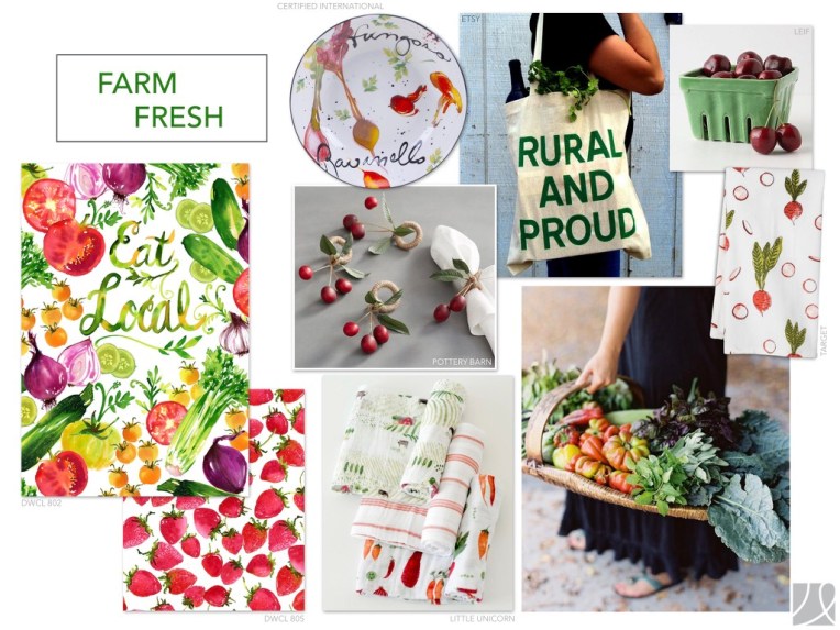
Farm Fresh is truly a lifestyle today centered around organic style painted veggies, fruits and flowers. Colors are vibrant, fresh and saturated. Don’t be afraid to mix and match techniques within prints…it’s an updated and sophisticated way to make these prints new this season.


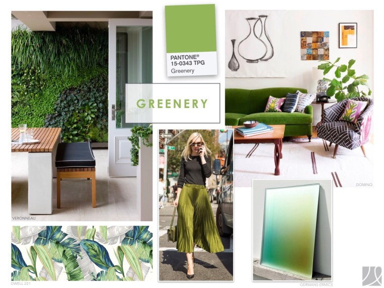
Cannot forget our Greenery this season with a shout-out to Pantone’s color of the year..we love pairing this special shade of green with contracting green shades creating depth and dimension..also adding black into the mix for a more sophisticated take on color!


Posting more updated trends for 2018 tomorrow…thanks for following💚

Opposites Attract 


Photo Credit @nancy_fire

Does “Black and White” really ever go out of style?

No matter what trade show I might be attending, or country I might be traveling to, I always seem to find products in black and white refreshing.

 It might be a resting point for my eye or a way to wipe my overstimulated mind clean after viewing so many patterns and colors…but wherever I am and whatever I post on social media I always seem to get an overwhelming response to black and white imagery!

Do some see it as a safe way to add print and pattern in their lives without too much chaos over adding color? 

Do some favor the simplicity of a graphic statement without color?

Do some see it as a secure way to decorate because it never seems to “Go out of Style”?

In my humble opinion…it could be “all of the above”…..because I personally look forward to finding my next resting point during my upcoming travels…and this is coming from a person who lives in a world of color and pattern!

Playful Products

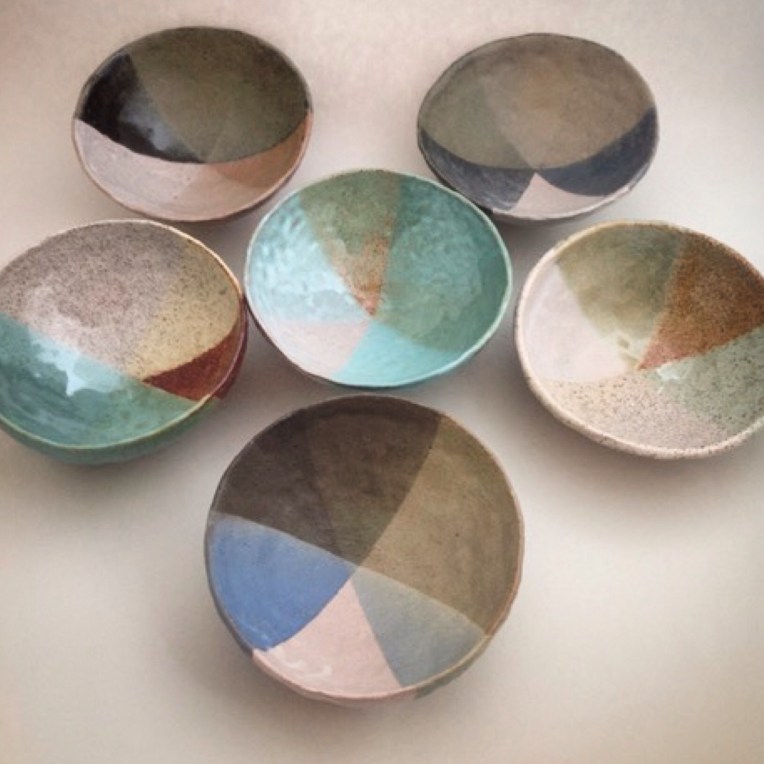
So nice to find playful products on my travels these days…really love the spontaneouty of these ceramic bowls for their color and imperfect pattern design. I am not a fan of matching patterns but I do love collections of similar objects….hence loving this ceramic collection!

Photo posted by nancy_fire

Posting from Paris

Off to Maison & Objet, the largest and most aspirational home product show in the world. Designers, as well as creative manufacturers gather to show their latest and greatest products for the home.
Most trade shows feel endless and overwhelming but I can promise there is No Chaos here…just color and creativity.
I will be posting on colorchaosand creativity all weekend with lots of updates from Paris AND you can follow me on Instagram @nancy_fire @hgtv @hgtvhome

2015/01/img_3050.jpg