KBIS Creativity

Fun filled day at the Kitchen and Bath Show at the Convention Center in Orlando. Creative home products that embrace new style, substrate and design produced by a multitude of amazing manufacturers and designers.

Ann Sachs “Green With Envy” at Koehler.

Bertazzoni Red Stove

Build A Hood

Matte Black at Wilsonart

Thermador Freedom Kitchen

Zac Posen For Momogram

Mixed Metals at Delta Faucets

Koehler Minimalist Sink

Artisan Aesthetic Lisbon Style

Bucket List Worthy!

Inspiration is everywhere in Lisbon, especially if you love Azulejos Tiles. Today these tiles are dominant in every Portuguese city and embedded in its history and culture.

The word “azulejo” means “small polished stone” and although they are not a Portuguese invention, by the 18th century no other European country was producing as many tiles as Portugal. Over the years, azulejo tiles have become an art form used for a variety of design applications both in exterior and interior home design.

Spending time in Bairro Atlo and Principe Real, two older areas of Lisbon, I spotted various azulejo tiles on homes in different color combinations and patterns. Below are a few of my favorites.

Heading back to our art/design studio in New York City, Design Works International, feeling inspired and excited to create our newest textile collections….and we just might have the perfect name….Artisan Aesthetic!

Graphic Greats…Black and White Prints and Patterns in Paris

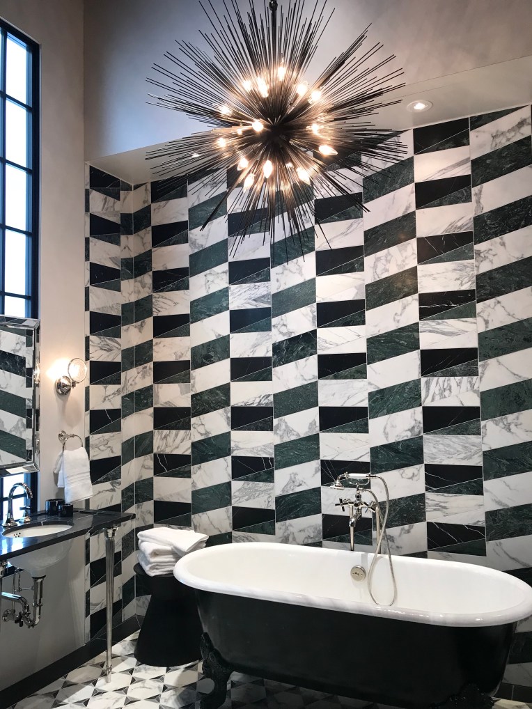
Bold bedding geometric inspired prints in black and white in BVH department store in the Marais section of Paris.

Gift set mug collections in black, white and gold featuring text graphics in various type fonts.

This teal color [on the blue side] is the second largest influential color behind black at retail in Paris.

Over scaled geometric prints lend a graphic vibe to any sofa, bed or chair.

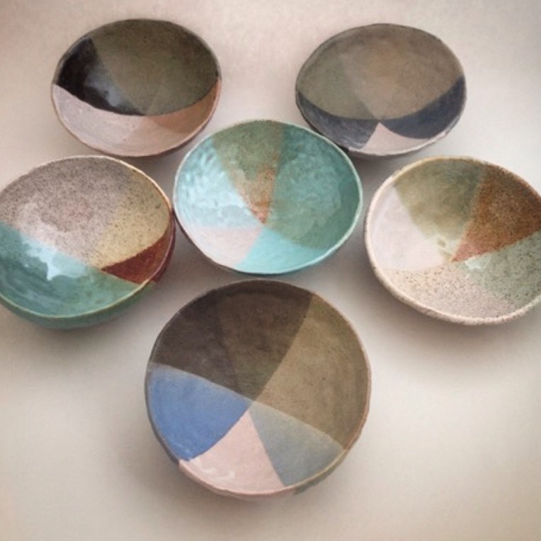
At the Merci Concept Store in the Marais section of Paris, tabletop was truly a trend to be reckoned with adding mini dishes and plates to the mix.

This bed set at Conran’s on the left bank of Paris was just one of many graphic inspired beds throughout the city.

At Galleries Lafayette Maison, these graphic towels in black and ecru have a tribal vibe that coordinate well with the graphics aesthetic of the season.

At Le Compagnie Francaise, graphic one color ikat patterns compliment this mixed substrate chair of leather and vinyl cording.

This woven bench detail at BVH is not only trend right, it’s a practical solution for expanding seating in your home.

At Merci Concept Store, it’s all about the graphic and global mix, showcasing authentic woven baskets in black and white, mixed with rustic matte and glossy black ceramic vessels.

Surtex NYC Trend Update Part Two

Surtex NYC Trend Updates From Color, Chaos and Creativity….Part Two


Colorful Contrasts highlight this season by adding fresh and fun color to an assortment of products from paper goods, tabletop, fashion as well as home decor accessories. Do not be afraid of positioning primary colors together especially in full coverage patterns. Royal blue, teal, red and fuschia are leading the pack with a powerful punch of color!


Jewel Toned Textures keep our textured trend alive in 2017-18 with a shift in color to a warmer color palette. Fuschia, tangerine, golden yellow with accents of blue are updated color combinations for the season.


Mostly in home decor we are still seeing soft pastel shades mixed with deep accents trending in fabric prints and patterns. Millennial Pink continues to take the lead with lilac, grey and yellow creating this Soft Edge update!


It’s back, looks like Seaform of the 80’s is back with a vengeance looking new and updated mixed with black and white.


Transitioning from Millennial Pink to Mauve/Lavender will be a trend we will be watching as pinks transition over the next few months.

All Design Works International Prints and Patterns are owned by our studio until time of purchase. To purchase designs log into designworksinternational.com and click on shop prints…you will need to sign into your account or create a new account. Any questions e-mail nfire@designworksintl.com

Product Personality at Maison Objet Miami

I was probably the biggest skeptic when I heard two years ago that my favorite overseas show was heading to Miami for its debut in America. It’s been two years now, I have attended both shows, walked all aisles, met new designers, found innovative products and love chillin’ in Maimi…so I guess I am no longer a skeptic and more of a fan!

Happy to share some global greats from this past Maison Objet show which took place in Miami May 10-13.

Neutral Nuances (top left) Porada, Roberta Schiling, Morada, Porada

Artisan Accessories (top left) FOS, Ritz and Marwitz, Ritz and Marwitz, FOS

Playful Products (top left) Studio Poli, Fermob, Matrone, Dransfield and Ross

Take A Seat (top left) Fenabel, Fenable, Serge De Troyer, Fenabel

Weaves and Watercolor (top left) Dransfield and Ross, Bertz, Forza Home, Dransfield and Ross

Sassy Suculents-Parisian Style


Photo by Nancy Fire

While in Paris on a trend shopping trip I came across these “Sassy Suculents” and immediately fell in plant love! I mean these guys just had it going on…perfect color, perfect texture and of course perfect pot! 

I love this “Rustic Glam” style, mixing smooth surfaces, beautiful tinted colors with the texture of these lava pots.

I wonder if a person not in the design field would feel the same way about these  sassy suculents and fall in plant love like I did!

We all know that suculents are trending now but like anything else when a trend hits you need to rethink your strategy so that you can reinvent your product in a more “trend right” sensibility!

I think these “Sassy Suculents-Parisian Style”…did just that!

Opposites Attract 


Photo Credit @nancy_fire

Does “Black and White” really ever go out of style?

No matter what trade show I might be attending, or country I might be traveling to, I always seem to find products in black and white refreshing.

 It might be a resting point for my eye or a way to wipe my overstimulated mind clean after viewing so many patterns and colors…but wherever I am and whatever I post on social media I always seem to get an overwhelming response to black and white imagery!

Do some see it as a safe way to add print and pattern in their lives without too much chaos over adding color? 

Do some favor the simplicity of a graphic statement without color?

Do some see it as a secure way to decorate because it never seems to “Go out of Style”?

In my humble opinion…it could be “all of the above”…..because I personally look forward to finding my next resting point during my upcoming travels…and this is coming from a person who lives in a world of color and pattern!

Watercolor Wednesday

Trending at my NYC based studio, Design Works International these days is the return of watercolor and original techniques that relate to a more artsy style and sensibility!

Exciting to see the return of dimension in design by creating imperfect layers of color…we love that “imperfect is the new perfect”! 

Knowing that blues are trending again in home lifestyle products we felt that this nice touch of warm rust complimented our original tile design.


       Image from our Design Works International Home Collection NYC. All rights reserved. 

Playful Products

So nice to find playful products on my travels these days…really love the spontaneouty of these ceramic bowls for their color and imperfect pattern design. I am not a fan of matching patterns but I do love collections of similar objects….hence loving this ceramic collection!

Photo posted by nancy_fire